
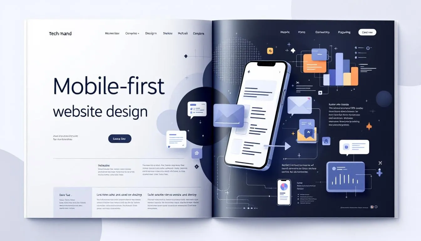
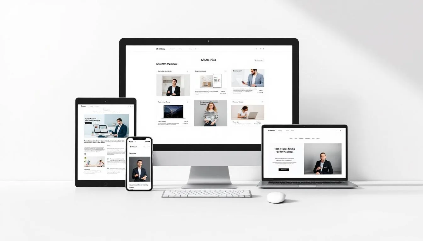
With most online traffic now coming from mobile devices, mobile first website design: why it matters, how to implement it is essential. This approach ensures your website is optimized for smartphone users from the start. In this article, we’ll explain why mobile-first design matters and provide simple steps to implement it.
Key Takeaways
- Mobile-first design is essential as over half of internet traffic comes from mobile devices, providing a competitive edge in user engagement.
- Key benefits include improved user experience, higher conversion rates, and enhanced website performance through optimized content and loading speeds.
- Implementing mobile-first design involves understanding the audience, prioritizing content, utilizing mobile-specific tools, and focusing on user experience and accessibility.
Why Mobile-First Website Design Matters
With more than half of internet traffic coming from mobile devices, mobile-first design is increasingly essential. A significant portion of user behavior has shifted significantly, with mobile devices now being the preferred method for accessing online content and mobile traffic now playing a crucial role. Businesses must adopt a mobile-first design strategy to effectively engage the majority of users.
A mobile-first approach keeps businesses relevant as mobile usage grows. A mobile-first website offers a competitive edge in attracting and retaining customers while aligning your digital presence with current user preferences. Prioritizing mobile design allows businesses to deliver a more satisfying and intuitive user experience.
A mobile-first website helps maintain a competitive edge in the digital landscape by:
- Meeting mobile users’ demands for fast, accessible, and user-friendly web pages
- Enabling businesses to create responsive designs that cater to various mobile devices
- Enhancing the overall user experience through mobile-first design principles
Benefits of Mobile-First Design
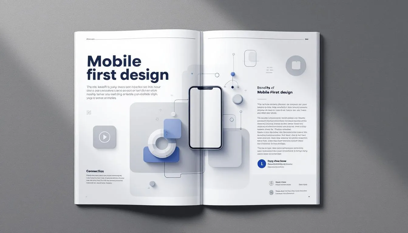
Mobile-first design offers numerous benefits that can significantly impact the success of your website. One of the primary advantages is the simplification of layout and focus on important content, leading to a more positive user experience. Mobile-first design, by prioritizing essential features, creates a focused user experience that boosts engagement. Mobile first design important is a concept that underscores the significance of these strategies.
A better user experience from mobile-first design can lead to increased engagement, higher conversion rates, and greater customer satisfaction. Designing a website with a mobile-first approach can drive higher conversions and increased revenue. Furthermore, mobile-first design enhances website performance with optimized content and faster loading speeds.
Adopting a mobile-first strategy offers several advantages:
- Increases a website’s visibility and improves its search engine ranking.
- Simplifies interfaces and prioritizes essential content, enhancing accessibility and readability.
- Includes touch-friendly elements, making content more user-friendly and accessible.
Key Principles of Mobile-First Design
Prioritizing essential content in a mobile-first design approach leads to cleaner and more efficient website layouts. Due to mobile limitations, mobile-first design inherently prioritizes mobile first content. A mobile-first mindset involves sorting information into primary, secondary, and tertiary content.
Essential principles for mobile-first design include:
- Creating fast and easy designs that facilitate intuitive navigation.
- Removing unnecessary elements to simplify navigation.
- Optimizing loading speed to accommodate mobile devices’ unique constraints, such as smaller screens and slower internet connections. These are the most important elements of effective mobile first design.
A fast and easy design is crucial for maintaining user engagement in mobile-first environments. Maintaining visual hierarchy is vital for presenting content effectively on mobile websites. Adhering to these principles helps web designers create mobile-first responsive designs that offer a consistent user experience across different screen sizes.
How to Implement Mobile-First Design
Implementing a mobile-first design requires a systematic approach to ensure that the needs of mobile users are met. Creating a mobile-first design involves four essential steps:
- Understanding your audience
- Prioritizing mobile content
- Utilizing mobile-first tools
- Testing your website before going live.
While top web design companies can assist in developing a mobile-first design strategy, understanding the process yourself empowers you to make informed decisions and ensure your website delivers an optimal mobile user experience in web development.
Let’s delve into each step in more detail.
Understand Your Audience
A mobile-first design strategy focuses on understanding audience needs to highlight essential content. Identifying user pain points early helps design a mobile experience that addresses specific needs. Designers should consider key information such as operating hours, exact location, and contact details when creating a website to create mobile first design.
The first step in the mobile-first design process is conducting a content inventory. This involves listing all the content pieces and identifying which ones are most important for your potential customers. Understanding what your users seek allows you to create a mobile experience that attracts and retains customers through effective content creation.
Prioritize Content for Mobile
Content for a mobile-first website must:
- Prioritize conciseness and importance.
- Be compact and easily readable.
- Be organized into primary, secondary, and tertiary categories to enhance usability.
Organize content for mobile-first design by listing pieces and ordering them numerically for clear structure.
When designing a mobile-first website, prioritize features that drive sales. The home page should feature essential elements like the company name, product links, and a blog post to achieve the site’s goal. Mobile-first design focuses on adding information to larger layouts instead of removing it for smaller screens.
Utilize Mobile-First Tools
Using mobile-first tools is crucial for creating effective mobile designs that enhance user experience. Tools like Adobe XD and Adobe Express help designers create mobile-optimized assets such as webpages and newsletters. Specific tools for implementing mobile-first design can streamline workflow and improve outcomes.
UXPin is a tool that facilitates mobile-first design prototyping, focusing on ui design. Its features include:
- Creating different layouts for different views, making it versatile for mobile designs
- Frames that support dynamic resizing and styling
- Allowing precise adjustments necessary for mobile prototypes
W3.CSS is a modern CSS framework designed for all device types, helping developers create responsive designs more easily.
Mobile-First Design vs. Responsive Design
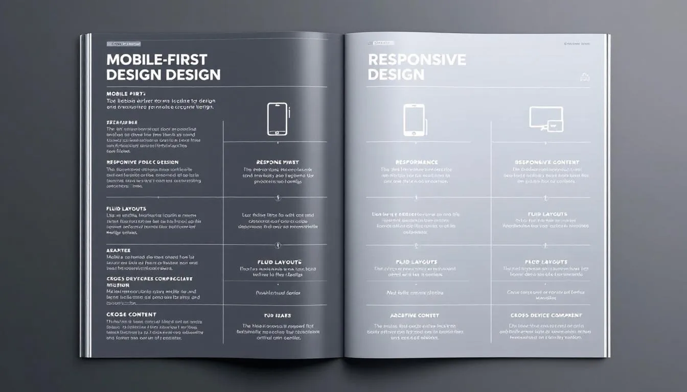
Mobile-first design is a design approach prioritizing mobile versions of websites. Responsive design adapts the layout for different screen sizes automatically. The differences between mobile-first and responsive design influence how developers prioritize and design website features to ensure optimal user experience across devices. This approach emphasizes mobile first responsive design to enhance accessibility.
Responsive design is reactive, adjusting layout based on device size, while mobile-first design is proactive, focusing on mobile experience from the start. Mobile-first focuses on mobile versions first; responsive adapts to various screen sizes.
Understanding these key differences helps web designers decide which opposite approach suits their needs.
Best Practices for Mobile-First Design
Following best practices is essential for creating an effective mobile-first design. The process includes:
- Establishing content priorities before adapting layouts for larger screens.
- Avoid disruptive pop ups.
- Ensuring fast loading times to enhance user experience on mobile devices.
Consistent user experience across devices is vital for engagement and satisfaction, achieved by adhering to mobile-first design principles. Let’s explore these best practices in more detail.
Focus on User Experience
Mobile-specific design offers a more intuitive user experience, enhancing engagement and increasing conversion rates. Mobile-first design usually offers a better user experience by planning for mobile needs alongside desktop features. Improving content clarity and simplifying design helps focus user attention.
Effective mobile-first design includes user-friendly navigation with larger touch targets and scrollable interfaces. Simplifying navigation by limiting menu items to around five facilitates easier access.
Focusing on user experience helps create mobile-first responsive designs that attract customers and retain customers.
Enhance Accessibility
A mobile-first approach enhances accessibility from the outset, making websites usable for a wider audience. Elements like font sizes and white space in mobile-first design are tailored to enhance readability on smaller screens. Simplifying interfaces in mobile-first design improves readability and navigation for users with different abilities.
Interactions should be designed for touch, ensuring buttons are large enough and spaced appropriately to avoid misclicks. Enhancing accessibility in mobile-first design ensures consistent user experience and higher user satisfaction across various screen sizes.
Optimize Loading Speed
Mobile-first design can result in faster loading times, crucial for retaining users on websites. Prioritizing mobile-first design can significantly improve page load times, crucial for both user satisfaction and search engine ranking. File compression techniques can significantly enhance the loading speed of mobile-first websites.
Images and videos should be optimized for mobile to prevent slow loading times and ensure proper display. Improve performance by improving loading speed for mobile-first websites requires removing unnecessary elements.
Examples of Effective Mobile-First Websites
Mobile-first design prioritizes user experience on mobile devices, making navigation intuitive for visitors, as demonstrated by Nationwide Insurance’s mobile site which categorizes users effectively. Shutterfly’s mobile site is designed for easy navigation and features stunning visuals to enhance user engagement.
Google Maps’ mobile website offers a seamless user experience mimicking the app’s functionality and aesthetics. Zappos enhances its mobile site by focusing on ease of searchability, catering to its extensive inventory.
Effective mobile-first websites, such as Lean Labs and Etsy, show that focused user experience design and aesthetic functionalities, including bright colors, lead to higher user engagement and satisfaction through progressive enhancement.
Common Challenges and Solutions in Mobile-First Design
A significant drawback of mobile-first design is the most limitations of screen size. This limitation restricts the amount of content that can be displayed effectively. Limited space on mobile screens and smaller screen sizes makes it challenging to display information without overcrowding. Mobile-first design can sometimes appear more formulaic than creative due to its focus on essential elements.
Starting with mobile design makes sense since simpler mobile code minimizes complications from adapting desktop users’ designs on smaller devices and different devices, including desktop devices and desktop view. Testing on actual mobile phones is crucial since emulators may not accurately reflect user experiences.
Addressing these challenges enables web designers to create mobile-first responsive web design that automatically adapt offers a consistent user experience across various screen sizes.
Ready to transform your website into a mobile-first masterpiece? Reach out to PS Creative today! With our expertise in creating mobile-first designs for various industries, we can help you create a website that stands out on all devices.


